Excess rentals in TfL bike sharing

Download the latest TfL data on how many bikes were hired every single day.
url <- "https://data.london.gov.uk/download/number-bicycle-hires/ac29363e-e0cb-47cc-a97a-e216d900a6b0/tfl-daily-cycle-hires.xlsx"

# Download TFL data to temporary file
httr::GET(url, write_disk(bike.temp <- tempfile(fileext = ".xlsx")))
## Response [https://airdrive-secure.s3-eu-west-1.amazonaws.com/london/dataset/number-bicycle-hires/2021-08-23T14%3A32%3A29/tfl-daily-cycle-hires.xlsx?X-Amz-Algorithm=AWS4-HMAC-SHA256&X-Amz-Credential=AKIAJJDIMAIVZJDICKHA%2F20210919%2Feu-west-1%2Fs3%2Faws4_request&X-Amz-Date=20210919T083508Z&X-Amz-Expires=300&X-Amz-Signature=27b3fde46dddd1b83e09b35e430768b14a3bf8acf9dff1f78d09bb9431a603ff&X-Amz-SignedHeaders=host]
## Date: 2021-09-19 08:35
## Status: 200
## Content-Type: application/vnd.openxmlformats-officedocument.spreadsheetml.sheet
## Size: 173 kB
## <ON DISK> C:\Users\User\AppData\Local\Temp\RtmpU3KEbb\file469017b2368c.xlsx# Use read_excel to read it as dataframe
bike0 <- read_excel(bike.temp,
sheet = "Data",
range = cell_cols("A:B"))
# change dates to get year, month, and week
bike <- bike0 %>%
clean_names() %>%
rename (bikes_hired = number_of_bicycle_hires) %>%
mutate (year = year(day),
month = lubridate::month(day, label = TRUE),
week = isoweek(day))Facet grid plots of bikes hired by month and year.
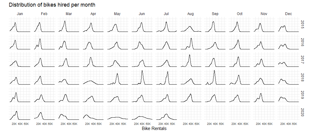
May and Jun in 2020 are significantly different compared to the previous years. This might be due to COVID, under which most people tend to transit less away from home, and employees usually work from home rather than to work at office.
Below 2 graphs showcase the difference between the expected number of rentals per week/month between 2016-2019 and then, see how each week/month of 2020-2021 compares to the expected rentals.
Mean rather than median will be used to calculate your expected rentals, since we would like the whole picture of the specific week or month.
Graph of monthly change in Tfl bike rentals, displaying changes from monthly average shown in Blue and calculated between 2016-2019.
# Filter 2016 to 2019 data
expected_monthly <- bike%>%
  filter(day >= dmy("01/01/2016"), day<dmy("01/01/2020"))%>%
  # Expected monthly average grouped by month derived from 2016-2019 data
  group_by(month)%>%
  summarise(expected_avg = mean(bikes_hired))

# Filter all data after 2016
monthly_rentals <- bike%>%
  filter(day >= dmy("01/01/2016"))%>%
  # Actual monthly average for the months
  group_by(year,month) %>%
  summarise(actual_avg=mean(bikes_hired)) %>%
  # Join expected average and actual average
  left_join(expected_monthly, by = "month")
## `summarise()` has grouped output by 'year'. You can override using the `.groups` argument.# Plot the monthly changes in Tfl bike rentals
monthly_rentals %>%
ggplot(aes(x=as.numeric(month)))+
# Indicate the expected average in blue
geom_line(aes(y=expected_avg),color="blue")+
geom_line(aes(y=actual_avg),color = "black")+
# Using geom_ribbon
# to create green shades for higher than expected average data
# and red shades for lower than expected average data
geom_ribbon(aes(ymin=expected_avg, ymax=pmax(actual_avg,expected_avg)),fill="springgreen1", alpha = 0.3) +
geom_ribbon(aes(ymin=pmin(actual_avg,expected_avg), ymax=expected_avg), fill="tomato", alpha = 0.3)+
# faceted by year
facet_wrap(~year)+
theme_bw()+
# Formatting with adjustment
theme(legend.position = "none",
strip.background = element_blank(),
panel.border = element_blank(),
plot.title = element_text(size = 9),
plot.subtitle = element_text(size = 7),
strip.text.x = element_text(size = 5),
axis.text.y = element_text(size = 5),
axis.text.x = element_text(size = 5))+
# Format x axis month names
scale_x_continuous(labels = function(x) month.abb[x])+
# Add title and axis labels
labs(title = "Monthly change in Tfl bike rentals",
subtitle = "Change from monthly average shown in Blue and calculated between 2016-2019",
x = "Month",
y = "Bikes rentals")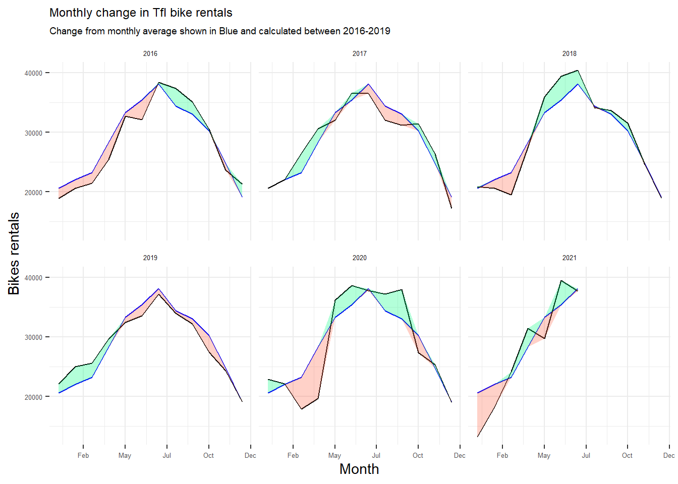
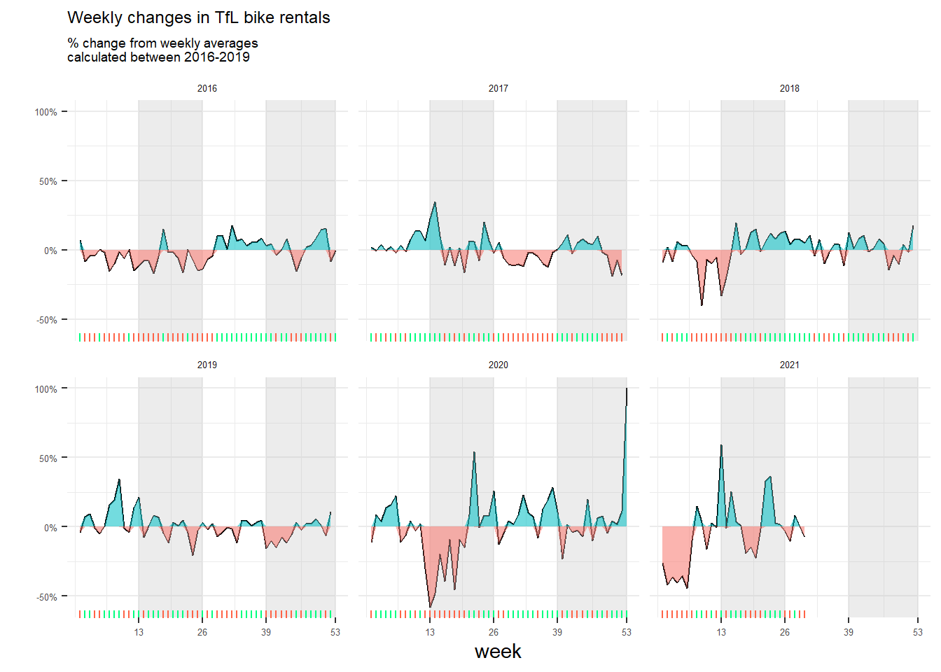
Graph of percentage changes from the expected level of weekly rentals. The two grey shaded rectangles correspond to Q2 (weeks 14-26) and Q4 (weeks 40-52).
# Filter 2016 to 2019 data,
# starting first day of week and endding last day of week
expected_weekly <- bike %>%
  filter(day>=dmy("4/1/2016") & day<=dmy("29/12/2019")) %>%
  # Expected weekly average grouped by month derived from 2016-2019 data
  group_by(week) %>%
  summarise(expected_rentals=mean(bikes_hired))

# Filter 2016 and onwards data, starting first day of week
weekly_rentals <- bike %>%
  filter(day>dmy("4/1/2016")) %>%
  group_by(year,week) %>%
  # Adjust current year data that falls on last week of prior year
  mutate(yearminusone = year - 1,
         year_week = ifelse(week==53 & month=="Jan",
                            paste(yearminusone,week,sep="-"),
                            paste(year,week,sep="-"))) %>%
  group_by(year_week) %>%
  # Actual monthly average for the months
  mutate(actual_rentals = mean(bikes_hired)) %>%
  # Filter one data for each week
  filter(day==max(day)) %>%
  ungroup() %>%
  # Join expected average and actual average
  left_join(expected_weekly,by =c("week")) %>%
  # calculate the percentage changes
  mutate(delta=(actual_rentals/expected_rentals- 1),
         delta = replace_na(delta, 1),
         month=ifelse(week==53,"Dec",month),
         year=ifelse(week==53,year-1,year)) %>%
  add_row(year=2016,week=53,delta=0)

# Graph weekly rentals plot
weekly_rentals %>%
  ggplot(aes(x=week,
             y=delta))+
  geom_line(aes(y = delta)) +
  # Create grey rectangular backgrounds for Q2 and Q4
  annotate("rect", xmin = 13, xmax = 26, ymin = -Inf, ymax = Inf, fill = "grey", alpha = 0.3)+
  annotate("rect", xmin = 39, xmax = 53, ymin = -Inf, ymax = Inf, fill = "grey", alpha = 0.3)+
  # Using geom_ribbon
  # to create green shades for higher than expected average data
  # and red shades for lower than expected average data
  geom_ribbon(aes(ymin=0, ymax=pmax(0, delta), fill="tomato", alpha = 0.3)) +
  geom_ribbon(aes(ymin=pmin(0, delta), ymax=0, fill="springgreen1", alpha = 0.3))+
  # Add rug marks on the x axis with the indicative green/red rugs.
  geom_rug(data=subset(weekly_rentals,delta>=0),color="springgreen1",sides="b")+
  geom_rug(data=subset(weekly_rentals,delta<0),color="tomato",sides="b")+
  # Facet by year
  facet_wrap(~year)+
  # Set y axis as percentage
  scale_y_continuous(labels = scales::percent)+
  # set x axis to display the last week of the quarters
  scale_x_continuous(breaks = c(13,26,39,53))+
  # Label title and axis
  labs(title="Weekly changes in TfL bike rentals",
       subtitle="% change from weekly averages \ncalculated between 2016-2019",
       x="week",
       y="")+
  theme_bw()+
  # Formatting with adjustment
  theme(legend.position = "none",
        strip.background = element_blank(),
        panel.border = element_blank(),
        plot.title = element_text(size = 9),
        plot.subtitle = element_text(size = 7),
        strip.text.x = element_text(size = 5),
        axis.text.y = element_text(size = 5),
        axis.text.x = element_text(size = 5))