Returns of financial stocks

We will use the tidyquant package to download historical data of stock prices, calculate returns, and examine the distribution of returns.
We must first identify which stocks we want to download data for, and for this we must know their ticker symbol; Apple is known as AAPL, Microsoft as MSFT, McDonald’s as MCD, etc. The file nyse.csv contains 508 stocks listed on the NYSE, their ticker symbol, name, the IPO (Initial Public Offering) year, and the sector and industry the company is in.
nyse <- read_csv(here::here("data","nyse.csv"))
glimpse(nyse)
## Rows: 508
## Columns: 6
## $ symbol <chr> "MMM", "ABB", "ABT", "ABBV", "ACN", "AAP", "AFL", "A", "~
## $ name <chr> "3M Company", "ABB Ltd", "Abbott Laboratories", "AbbVie ~
## $ ipo_year <chr> "n/a", "n/a", "n/a", "2012", "2001", "n/a", "n/a", "1999~
## $ sector <chr> "Health Care", "Consumer Durables", "Health Care", "Heal~
## $ industry <chr> "Medical/Dental Instruments", "Electrical Products", "Ma~
## $ summary_quote <chr> "https://www.nasdaq.com/symbol/mmm", "https://www.nasdaq~Based on this dataset, a table and a bar plot was created to show the number of companies per sector, in descending order
# Create table by sector in descending order of number of companies
companiesPerSector <- nyse%>%
  group_by(sector)%>%
  count(sort = TRUE, name = "numOfComp")
companiesPerSector
## # A tibble: 12 x 2
## # Groups: sector [12]
## sector numOfComp
## <chr> <int>
## 1 Finance 97
## 2 Consumer Services 79
## 3 Public Utilities 60
## 4 Capital Goods 45
## 5 Health Care 45
## 6 Energy 42
## 7 Technology 40
## 8 Basic Industries 39
## 9 Consumer Non-Durables 31
## 10 Miscellaneous 12
## 11 Transportation 10
## 12 Consumer Durables 8# Create bar plot
ggplot(companiesPerSector, aes(x = numOfComp, y = reorder(sector,numOfComp),fill=sector))+
geom_col()+
labs(x = "Number of Companies",
y = "Sector",
title = "Number of Companies in each Sector")+
theme_bw()+
theme(legend.position="none")+
NULL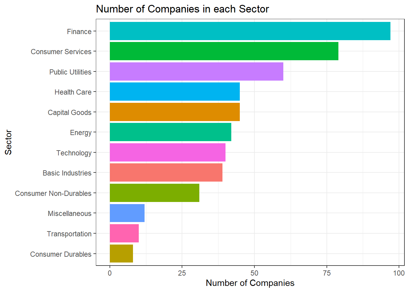
6 stocks including the the SP500 ETF (Exchange Traded Fund) was selected to perform the analysis.
# Select prices of the 6 stocks with SPY with a time frame
myStocks <- c("AAPL","DIS","DPZ","ANF","TSLA","SPY" ) %>%
  tq_get(get  = "stock.prices",
         from = "2011-01-01",
         to   = "2021-08-31") %>%
  group_by(symbol)

# Examine the structure of the resulting data frame
glimpse(myStocks)
## Rows: 16,098
## Columns: 8
## Groups: symbol [6]
## $ symbol <chr> "AAPL", "AAPL", "AAPL", "AAPL", "AAPL", "AAPL", "AAPL", "AAPL~
## $ date <date> 2011-01-03, 2011-01-04, 2011-01-05, 2011-01-06, 2011-01-07, ~
## $ open <dbl> 11.63000, 11.87286, 11.76964, 11.95429, 11.92821, 12.10107, 1~
## $ high <dbl> 11.79500, 11.87500, 11.94071, 11.97321, 12.01250, 12.25821, 1~
## $ low <dbl> 11.60143, 11.71964, 11.76786, 11.88929, 11.85357, 12.04179, 1~
## $ close <dbl> 11.77036, 11.83179, 11.92857, 11.91893, 12.00429, 12.23036, 1~
## $ volume <dbl> 445138400, 309080800, 255519600, 300428800, 311931200, 448560~
## $ adjusted <dbl> 10.10622, 10.15897, 10.24207, 10.23379, 10.30708, 10.50119, 1~Financial performance analysis depend on returns. Given the adjusted closing prices, daily, monthly, and yearly returns are calculated.
#calculate daily returns
myStocks_returns_daily <- myStocks %>%
  tq_transmute(select     = adjusted,
               mutate_fun = periodReturn,
               period     = "daily",
               type       = "log",
               col_rename = "daily_returns",
               cols = c(nested.col))

#calculate monthly  returns
myStocks_returns_monthly <- myStocks %>%
  tq_transmute(select     = adjusted,
               mutate_fun = periodReturn,
               period     = "monthly",
               type       = "arithmetic",
               col_rename = "monthly_returns",
               cols = c(nested.col))

#calculate yearly returns
myStocks_returns_annual <- myStocks %>%
  group_by(symbol) %>%
  tq_transmute(select     = adjusted,
               mutate_fun = periodReturn,
               period     = "yearly",
               type       = "arithmetic",
               col_rename = "yearly_returns",
               cols = c(nested.col))
A table which summarises monthly returns for each of the stocks and SPY with min, max, median, mean, SD.
monthlyReturnSummary <- myStocks_returns_monthly%>%
  summarise(monthly_max = max(monthly_returns),
            monthly_min = min(monthly_returns),
            monthly_mean = mean(monthly_returns),
            monthly_median = median(monthly_returns),
            monthly_sd = sd(monthly_returns))
monthlyReturnSummary
## # A tibble: 6 x 6
## symbol monthly_max monthly_min monthly_mean monthly_median monthly_sd
## <chr> <dbl> <dbl> <dbl> <dbl> <dbl>
## 1 AAPL 0.217 -0.181 0.0245 0.0257 0.0785
## 2 ANF 0.507 -0.421 0.00922 0.00287 0.145
## 3 DIS 0.234 -0.179 0.0155 0.00946 0.0682
## 4 DPZ 0.342 -0.188 0.0314 0.0253 0.0746
## 5 SPY 0.127 -0.125 0.0123 0.0174 0.0381
## 6 TSLA 0.811 -0.224 0.0523 0.0148 0.176Density plots for each of the stocks by faceting
ggplot(myStocks_returns_monthly, aes(monthly_returns))+
  geom_density()+
  facet_wrap(~symbol)+
  labs(x = "Distribution of Monthly Return",
       y = "Probability % ",
       title  = "Probability Distribution of Monthly Returns")+
  theme_bw()+
  NULL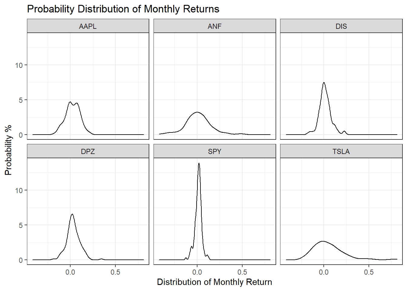
Tesla is the riskiest stock as it has the highest spread, which means its monthly standard deviations are the highest. The least risky is SPY as it has the narrowest spread.
A plot that shows the expected monthly return (mean) of a stock on the Y axis and the risk (standard deviation) in the X-axis.
# ggrepel function helps repel overlapping text labels
library(ggrepel)
ggplot(monthlyReturnSummary, aes(x = monthly_sd, y = monthly_mean))+
  geom_point(size = 4, aes(color = symbol))+
  ggrepel::geom_text_repel(aes(label = symbol), size = 4)+
  labs(x = "Standard Deviation of Monthly Returns",
       y = "Average Monthly Returns",
       title = "Risk vs Potential Return")+
  theme_bw()+
  NULL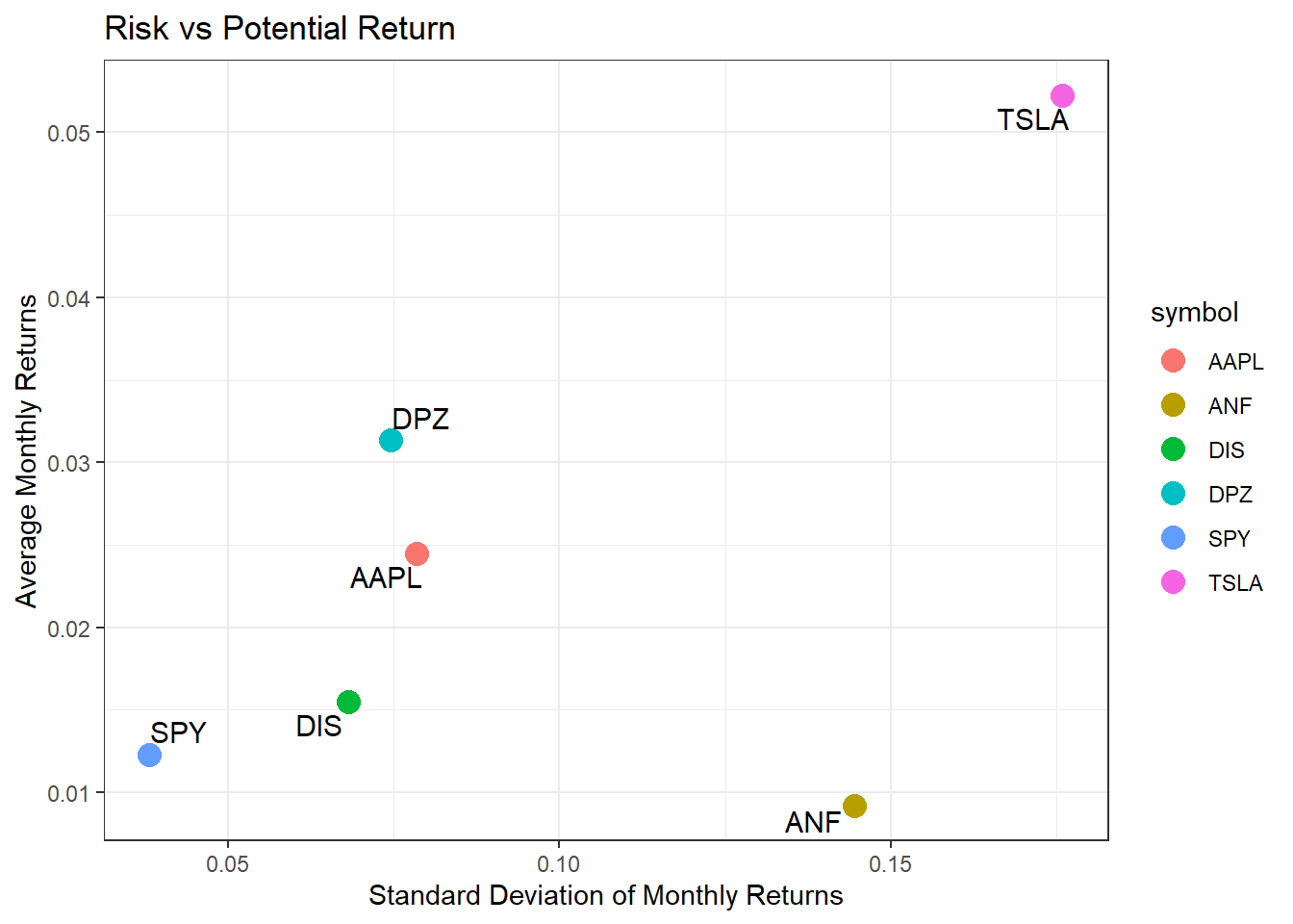
ANF is much riskier than most, while delivering the lowest returns.